
In the vast digital universe, where screens come in all shapes and sizes, one superhero emerges to save the day – Responsive Design! Imagine if your favorite superhero could adapt to any situation effortlessly – that’s precisely what responsive design does for websites. It’s the chameleon of the digital world, ensuring your online experience is smooth and delightful, no matter the device.
The Journey of Responsive Design:
Let’s take a journey into the digital cosmos, where websites used to be rigid and inflexible. You’d visit a site on your computer, and it looked fantastic. But oh, the horror when you tried it on your phone – it resembled a puzzle missing a few pieces. That’s when responsive design swooped in with its cape, ready to save the day.
- Adaptability Across Devices:
Responsive design is like a shape-shifter, effortlessly transforming to fit the screen it’s viewed on. Whether you’re on a massive desktop monitor or a pocket-sized smartphone, the website adjusts itself to provide an optimal viewing experience.
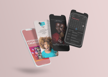
")
Why Responsive Design Matters:
Now, you might wonder, “Why should I care about how websites look on my toaster?” Well, maybe not your toaster, but the point is, that people access the internet on various devices. Imagine trying to read an article on your smart fridge – responsive design ensures it’s a seamless experience.
- Mobile Dominance: In the digital realm, mobile devices rule the kingdom. More people access the internet via smartphones than ever before. Responsive design is like a digital tailor, custom-fitting websites for the most widespread device – the smartphone.
- A Global Affair: Now, let’s zoom in on our African friends. In bustling cities and serene villages, people are navigating the digital landscape on diverse devices. Responsive design caters to this variety, making sure everyone gets a slice of the internet pie, whether they’re in Lagos, Nairobi, or Cape Town.
The Magic Behind the Scenes:
How does responsive design work its magic? It’s a bit like having a personal assistant who anticipates your needs.
- Media Queries:
Responsive design uses “media queries” – lines of code that ask the website, “Hey, how much space do we have here?” These queries ensure that the website responds appropriately to different screen sizes. - Flexible Grids:
Imagine a website as a flexible grid. With responsive design, this grid adjusts its layout and elements based on the screen size. It’s like a dance – graceful and synchronized. - The Future of Responsive Design:
As we gaze into the digital crystal ball, what does the future hold for responsive design? - Device Evolution:
With new devices emerging faster than memes go viral, responsive design will continue evolving. From foldable phones to holographic displays, websites will gracefully adapt to whatever the future tech gods throw our way. - Global Connectivity:
In Africa and beyond, internet connectivity is soaring. Responsive design will play a crucial role in ensuring that the expanding digital audience enjoys a consistent and delightful online experience.
Conclusion: The Hero We Need:
In this digital saga, responsive design stands tall as the unsung hero, ensuring that every click, scroll, and tap is a joyous adventure. So, the next time you’re browsing the web on your smartwatch or VR headset, tip your hat to responsive design – the true hero of the digital age!


